This documentation page is a resource for designers, content managers, and developers, providing best practices and the PartnerComm standard. The purpose of this page is to maintain front-end and visual consistency across all of our client projects.
You will find badges associated with your department and how those sections apply to what you do here at PartnerComm.
Example:
Developers / Designers / Content ManagersHeadings
Developers / Designers / Content ManagersHeadings and subheadings organize content for readers and should be very descriptive.
Headings (H1) give people a taste of what they’re about to read. Use them for page and blog titles.
Subheadings (H2, H3, etc.) break articles into smaller, more specific sections. They give readers avenues into your content and make it more scannable.
Headings and subheadings should be organized in a hierarchy, with heading first, followed by subheadings in order. (An H2 will nestle under H1, an H3 under H2, and on down.)
Include the most relevant keywords in your headings and subheadings, and make sure you cover the main point of the content.
Use title case, unless the heading is a punctuated sentence. If the heading is a punctuated sentence, use sentence case. Use sentence case for subheadings regardless of end punctuation.
Body Text
Developers / Designers / Content ManagersThis is the featured text! The featured text should only be used for introduction paragraphs within sections. It's applied using the .featured-text class.
This is the base body copy. Body copy is set in the $base_font variable in the _vars.scss partial. For projects that require variable body copy sizes, please use the pixel to rem mixin @include prem( ); and pass the pixel value within the parenthesis. The font size also includes lists unordered and ordered lists.
Meta copy, footnotes, and captions are used for styling ancillary content which represents additional details about the "main" content and not the main content itself and should be declared using small element. To adjust the font size of this content, please visit the _typography.scss partial.Links
Developers / Content ManagersHyperlinks should be used whenever we're referring to something on the actual site, and external resource, or a document such as a PDF. Use links to point users to relevant content and trusted external resources.
Don’t include preceding articles (a, an, the, our) when you link text. For example:
- GOOD Read our services page for more details.
- BAD Read our services page for more details.
If a link comes at the end of a sentence or before a comma, don’t link the punctuation mark.
All external links should be accompanied by a target="_blank" attribute.
Avoid saying things like "Click here!" or "Click for more information" or "Read this." Links should only link to relevant keywords through the natural flow of the content structure.
Links should have it's own distinctive style that separates it from the body copy, strong, and emphasis text. They should have a hover state that communicates to the user that it's interactive and requires the user to click to view the additional resource. Links should also have a distinct active/visited/focus state.
Lists
Developers / Designers / Content ManagersUse lists to present steps, groups, or sets of information. Give context for the list with a brief introduction. Number lists when the order is important, like when you’re describing steps of a process. Don’t use numbers when the list’s order doesn’t matter.
If one of the list items is a complete sentence, use proper punctuation and capitalization on all of the items. If list items are not complete sentences, don’t use punctuation, but do capitalize the first word of each item.
Select Dropdown Menus
Developers / DesignersSelect drop-down menus can be great when used properly. They conserve screen space and prevent users from entering bad data.
Use title case for menu names and sentence case for menu items.
Responsive Background Images
DevelopersResponsive background images utilizes Backstretch.js and allows the background image to scale proportionately with the viewport size. At the beginning of each project, please add your images to the $.backstretch array in the scripts.js file. In the _background-images.scss partial, you will find the global .bg class and the ability to extend the declaration of additional background images.
For consistency purposes, please name the image url and the class the same name. For example, bg-two.jpg with a class name of .bg-two.
Classes
Developers / Content ManagersThis starter theme ships with Bootstrap 4 and all it's styling/utility classes. Bootstrap 4 classes can be easily overwritten using custom classes. Please visit the Bootstrap Codex for usage details or the Bootstrap Documentation Page for more details on the library.
All custom classes should be appended to the end of web element and followed with a prefix of pc-.
Example: d-flex justify-content-center .pc-wrap
Since we use classes and id's to provide specific modifications through our stylesheets, the naming convention for declarations should be similar to avoid confusion for other developers.
Example:
Content Width
Developers / DesignersResponsive web design is a collection of practices to ensure the flexibility and fluidity of web content. With that in mind, it's essential that web content remains fluid within it's containing wrapper.
During the design phase, it's important not to add a width value to content to achieve a specific aesthetic layout (such as a section header with associated intro text). Capping the width of content to a specific width value that is less than the containing width of it's intended wrapper can result in unwanted or irregular whitespace.
Spacing within content wrappers should be defined by padding.
Colors
Developers / DesignersColor consistency is extremely important to every client project! It's how we represent our clients and should be consistent no matter who's designing or developing the project during its lifetime.
Each client project will have a style guide and a color palette section that will provide RGB, CMYK, and HEX color values for you to reference from.
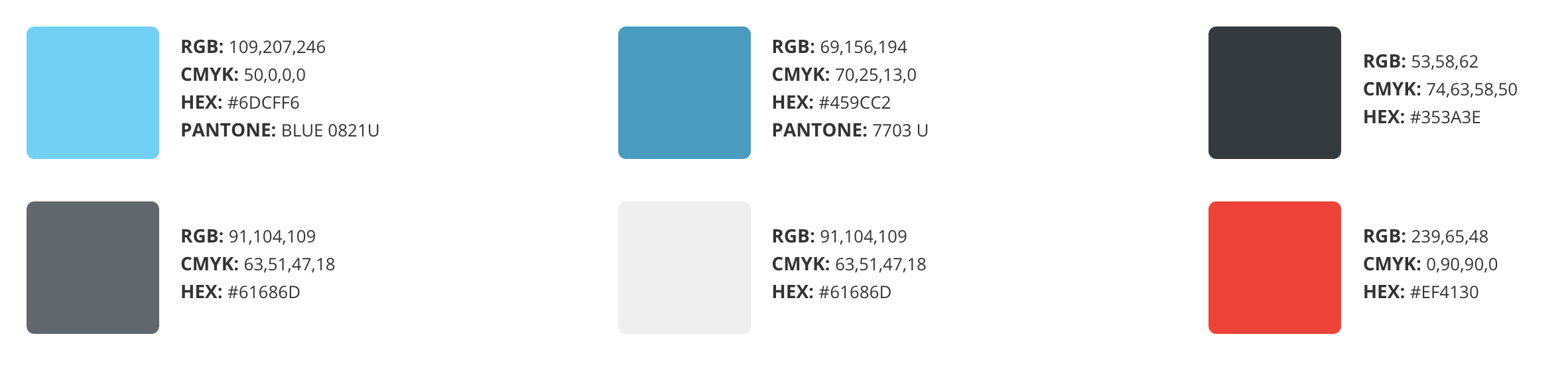
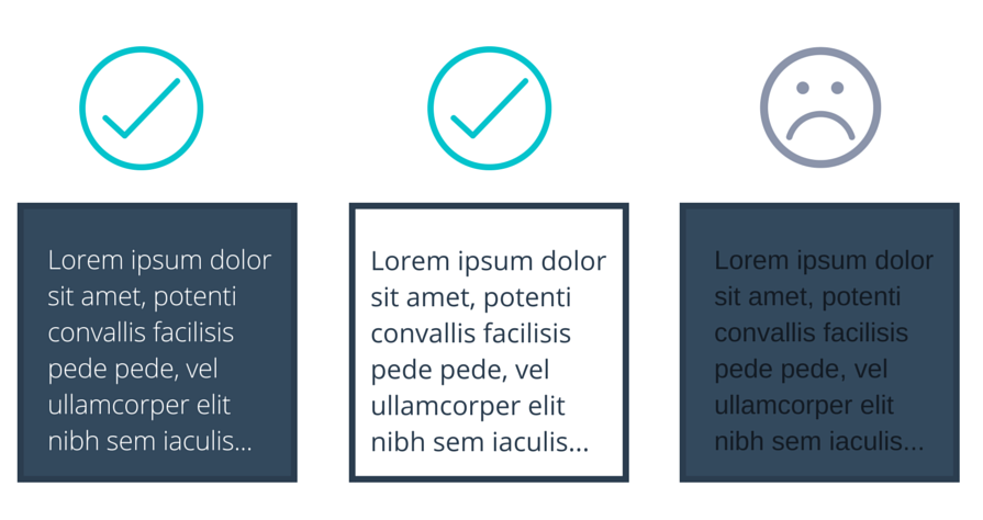
Background colors and font colors should contrast. Text should be easy to read and shouldn't cause eye strain for users. There must be a high contrast between the text color and the background color. Choose either a dark font color on a light background, or light text on top of a dark background.
Good contrast ensures that we're following web accessibility standards for users with vision impairments.
To lighten or darken colors, do not add additional color variables to do so. Instead, use the lighten() darken() functions provided by Sass. Example provided below.
Tabs
Developers / DesignersIt's generally a good idea to use tabs when there's multiple categories of content for a particular section. Tabs can help consolidate content more efficiently by reducing the amount of scrolling a user has to do.
Tabs Best Practice:
- Tab category names should be short and concise.
- Tabs should fit nicely in a single row.
- Tabbed category content should be similar in nature. It should make logical sense that they're tabbed together.
- BAD Nesting tabs within tabs creates jumping UI elements and is considered bad practice. It also creates an excessive level of complexity and visual hierarchy issues. The purpose of the tabbed navigation is to allow people to compare content simultaneously in a seamless manner by clicking on adjacent tabs to read relevant content.
- Active tab color should be the same color as the background color of the open content. This provides clarity to users that the content is associated with the current tab in its active state.
- Inactive tab colors should be either be a lighter or darker version of the active state color. The colors need to consistent with the active state. Tabs should not be all different kinds of colors.
Modal Windows
Developers / DesignersModal windows are a great way to save screen real estate and grabbing a user's attention to important information throughout a site, but it should be used sparingly. Modals have become today's version of a pop-up window and can create bad user experience if used excessively.
When to use a modal window:
- To get a user's attention when you want to interrupt a user’s current task to catch the user’s full attention to something more important.
- Getting the user's input (Ex. Sign up or login form).
- Use when you want to show additional information without losing the context of the parent page (Ex. Larger images or videos).
- Use when you want to show information that is not directly related to the parent page or other options that are “independent” from other pages (Ex. notifications).
Bootstrap 4 basic modal window:
All modals should include a close button and a descriptive title.
Parallax & Animations
Developers / DesignersParallax: Is the apparent displacement of foreground objects (content) from its relative background object (background image) based on users scrolling interaction.
Example Sites of parallax usage:
Animations: Animations makes it possible to animate transitions from one CSS style configuration to another. Animations can be a pleasurable user experience on many applications, but it can also become a nuisance and deter users from engaging with your site if done excessively.


